"Graffiti (strictly, as singular, "graffito," from the Italian — "graffiti" being the plural) are images or letters applied without permission to publicly viewable surfaces such as walls or bridges. Graffiti has existed at least since the days of ancient civilizations such as Ancient Greece and the Roman Empire. Graffiti has changed over time into what are known as "modern graffiti": the public defacing of a surface using spray paint, markers, or other materials. When graffiti painting is done without the property owner's consent, it can be considered vandalism, which is punishable by law in most countries.
Graffiti can be used to communicate social and political messages, and as a form of advertising. It is also considered a modern art form, and can be seen in galleries around the world."
(from http://en.wikipedia.org/wiki/Graffiti)
First of all, I see graffiti as art, not design. I may or may nor serve the purpose of communication, but it communicates using art form, not design form.
To me, graffiti is primarily of western style due to the hardness of style. It's rough, tough, rebellious and out of control, not something usual here in the east.
Recently, graffiti has appeared here in Vietnam, well, under the form of graffiti like the west, not some foul text on the walls like "Khoan cat be tong" or "Cam dai". I think it's just an adaption of western style, not something original.
I frankly can't imagine an Vietnamese visual theme formed of graffiti art. It may be a different style originated from the western style, but a complete Vietnamese style? Uhm, really can't imagine. If there's a form of graffiti art that is completely Vietnamese, it has to be those text on the wall advertising for "Khoan cat be tong" (*sigh*). Not much great as a style, isn't it?
Sunday, April 22, 2007
Sunday, April 15, 2007
Avis logo

This is the logo I designed for the Video Production's assignment: film title sequence. This is the logo of a fictional film company. The name must come from our initials, hence Anh Vo Independent Studio.
I did this logo pretty fast, 15 minutes to thought it out and a little some more time to finalize it. A friend of mine (who isn't a design student) said: "it's pretty nice, but nothing special and there're logos that use the same style". Frankly, I knew it all (but still pissed off). But... in the end, I just need a nice logo for the film title sequence. The assignment isn't a logo assignment. It's not like that I didn't care much, but to my personal experience, there are not so many logos that can impress me at the first sight, and there are tons of logo that are similar to one another (it may be lack of proof, but well, as far as I remember, it is it). So I didn't expect my 15 minutes logo to be original/innovative and impressive, did I?
This may sound unambitious, but for not too important designs, I don't think I need to spend much time to make it unique and original and impressive.
Still...I'm glad with the out come of this logo, so I'm still very pissed off by what my friend said (even though he wasn't wrong).
Sunday, April 8, 2007
Cell-shading
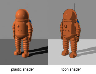
Cel-shaded animation (also called "cel-shading" or "toon shading") is a type of non-photorealistic rendering designed to make computer graphics appear to be hand-drawn. Cel-shading is often used to mimic the style of a comic book or cartoon. It is a somewhat recent addition to computer graphics, most commonly turning up in console video games.

From http://en.wikipedia.org/wiki/Cell-shading
I've heard about cell-shading many times before actually do some researches. Above is the definition from wikipedia. I actually don't care much what they say. Simply put, to me, cell-shading is a technique of coloring that uses block of colors to render an image, creating the feeling of depth (but obviously still 2-dimensional).
Cell-shading is most used in anime and animation. In the definition above, they said that it's used in comic books books and video game. I've seen comic books using cell-shading, not many though, but the best examples are Spiderman and Superman. The same thing goes for video games, aside from Digital Devil Saga, I admit that I've never seen any other games that use cell-shading. With the development of 3D technology, the game makers usually make their games look more 3D than 2D.
As said, cell-shading is most used in anime and animation although in some animation and most anime, the background is usually rendered more realistically (it means that they use less cell-shading).
 (http://en.wikipedia.org/wiki/Image:Ichigo_Kurosaki.jpg)
I wonder if it's because of cell-shading that to me every animes look like they've been drawn by the same artist (whereas they look totally different in the manga).
Subscribe to:
Posts (Atom)