This is some funny thoughts that I had about "definition" when reading Scout McCloud's Understanding comics: the invisible art
First, this is his definition about art (page 164): "Art, as I see it, is any human activity which doesn't grow out of either of our species' two basic instincts: survival and reproduction."
Thus: "Yet in almost everything we do there is at least an element of art."
I don't intent to debate the definition of art, but after seeing his, I came back to his definition about comics (which I wasn't really satisfied): comics: Juxtaposed pictorial and other images in deliberate sequence, intended to convey information and/or to produce an aesthetic response to the viewer.
I doesn't disagree with this. Taking a today's comic, breaking it down and assigning the definition, it suits perfectly. The problem is that the definition suits more than just it.
To that definition, the kind of picture manuscript carved onto cave's walls long ago, or Egyptian painting can be called comics.
But I wonder, how many people will agree with me if I show them those and say "They're comics". Very likely that I'll receive "Hell no."
Manga is comics, right. But to me (and some people), it feels strange to say such things. To me and the likes of me, comics is of western, and manga is...manga, it belongs to Japan. It's just that, the right definition (I'm assuming that McCloud is right, because I agree with that definition) won't work commonly if people don't feel that way. And to my common sense, manga is not comics.
I actually want to say more about common sense but suddenly all the inspiration flew away =.=
But in short, what I'm trying to say: language is very vague and the way we use it is much more vague. As for definition (of any kind), I think the aspect of how it's commonly perceived should be considered more. We live in a community after all. Language is just something we invent to refer to something, and it certainly can be altered by the ones who invented it: we.
Sunday, May 20, 2007
Sunday, May 6, 2007
Lady Snowblood (film)
 Alternative Title
Shurayuki Hime (Japanese Title)
Film Year
1973
Directed by
Toshiya Fujita
Writting Credits
Kazuo Uemura
Kazuo Koike
Starring
Meiko Kaji (as Yuki Kashima/Shurayuki-hime)
Toshio Kurosawa (as Ryûrei Ashio)
Genre
Drama
Thriller
Tagline
Plot Summary
Yuki's family is nearly wiped out before she is born due to the machinations of a band of criminals. These criminals kidnap and brutalize her mother but leave her alive. Later her mother ends up in prison with only revenge to keep her alive. She creates an instrument for this revenge by purposefully getting pregnant. Though she dies in childbirth, she makes sure that the child will be raised as an assassin to kill the criminals who destroyed her family. Young Yuki never knows the love of a family but only killing and revenge.
Run Time
01:37:17
Thanks to Kill Bill that there are more people (including me) know about this movie. Why? Because the song "The flower of carnage" (Shuka no hana), used after the bride kills Oren I-shii, is actually taken from Lady Snowblood. And ironically, the re-released DVD of Lady Snowblood has the line: Movie soundtrack contains the song "The flower of carnage" ("Shuka no hana") featured in Quenten Tarantino's "Kill Bill vol. 1" . It should be the other way around, I think.
Aside from the song, Tarantino has borrowed more from Lady Snowblood: the revenge theme (tracking and taking down one by one) the chapter format, the assassin heroine as well as many similar shots (and blood spray). After watching Lady Snowblood, I could say that they are pretty similar to each other (or should it be Kill Bill is pretty similar to Lady Snowblood). While I (maybe) don't really care about that, I've been thinking about one thing: when will be it be "inspiration" and when will it not?
Now for the film itself. It was made on 1973 so so obviously it can't be compared to Kill Bill or any films nowadays. However, except from the fact that the blood looks too fake and the low-quality picture, everything else is fine. The film focus more on Lady Snowblood's revenge (it's the main story, anyway), and has less (if not none) sexuality (in the manga Lady Snowblood tends to use her body frequently to achieve her goals). The film is good standing alone, but because most people watch it after watching Kill Bill, the joy is pretty much lessened.
There is a sequel of this one, namely "Shuryuki Hime: Urami Renga" (Lady Snowblood: Love song of vengence) and it has nothing to do with either the manga or Kill Bill so I just leave it out.
Anyhow, anybody watched Kill Bill should watch this one, to see how much Tarantino has been inspired.
References:
http://www.imdb.com/title/tt0158714/
http://www.imdb.com/title/tt0072157/
Lady Snowblood (manga)
Lady Snowblood (Shurayuki hime) is a manga written by Kazuo Koike and illustrated by Kazuo Kamimura. It was first publish in the 1970s and rencently published in English by Dark Horse Comics. The manga featured a title character who is seeking revenge for her mother while making a life as an assassin. 1973, the manga was adapted in two a move with the same name, starring Kaji Meiko as lady Snowblood. This movie later became an inspiration for Quenten Tarantino's famous Kill Bill.
 The English verions of the manga (obviously, I can't have read the Japanese version, can I?) consists of 4 volumes, each contains 3 - 4 episodes. The episode usually self-contained, while still contributing for the main story.
The manga dated back to the 1970s, so the drawings is of the old style (Tezuka's manga is a good example for this style). The graphic is not eye-catching (though still enjoyable) has a feel of water-color painting. There are also errors on human anatomy and perspective. The pictures are almost refrained in their frames, and no flashy screen tone or effects are used at all. While this is not necessarily a bad thing, it makes the pace slower and the story less intense than I had hope (or maybe because I watched the movie first?). The manga contains many gore, violence and sexuality (including homosexuality) and the graphic surprisingly is very well used.
The only reason that I want to talk about this manga is because of its movie adaption (I usually like to track down the origin of something). This manga is the start of everything: Lady Snowblood manga -> Lady Snowblood film -> Kill Bill
References
http://en.wikipedia.org/wiki/Lady_Snowblood
Sunday, April 22, 2007
Graffiti
"Graffiti (strictly, as singular, "graffito," from the Italian — "graffiti" being the plural) are images or letters applied without permission to publicly viewable surfaces such as walls or bridges. Graffiti has existed at least since the days of ancient civilizations such as Ancient Greece and the Roman Empire. Graffiti has changed over time into what are known as "modern graffiti": the public defacing of a surface using spray paint, markers, or other materials. When graffiti painting is done without the property owner's consent, it can be considered vandalism, which is punishable by law in most countries.
Graffiti can be used to communicate social and political messages, and as a form of advertising. It is also considered a modern art form, and can be seen in galleries around the world."
(from http://en.wikipedia.org/wiki/Graffiti)
First of all, I see graffiti as art, not design. I may or may nor serve the purpose of communication, but it communicates using art form, not design form.
To me, graffiti is primarily of western style due to the hardness of style. It's rough, tough, rebellious and out of control, not something usual here in the east.
Recently, graffiti has appeared here in Vietnam, well, under the form of graffiti like the west, not some foul text on the walls like "Khoan cat be tong" or "Cam dai". I think it's just an adaption of western style, not something original.
I frankly can't imagine an Vietnamese visual theme formed of graffiti art. It may be a different style originated from the western style, but a complete Vietnamese style? Uhm, really can't imagine. If there's a form of graffiti art that is completely Vietnamese, it has to be those text on the wall advertising for "Khoan cat be tong" (*sigh*). Not much great as a style, isn't it?
Sunday, April 15, 2007
Avis logo

This is the logo I designed for the Video Production's assignment: film title sequence. This is the logo of a fictional film company. The name must come from our initials, hence Anh Vo Independent Studio.
I did this logo pretty fast, 15 minutes to thought it out and a little some more time to finalize it. A friend of mine (who isn't a design student) said: "it's pretty nice, but nothing special and there're logos that use the same style". Frankly, I knew it all (but still pissed off). But... in the end, I just need a nice logo for the film title sequence. The assignment isn't a logo assignment. It's not like that I didn't care much, but to my personal experience, there are not so many logos that can impress me at the first sight, and there are tons of logo that are similar to one another (it may be lack of proof, but well, as far as I remember, it is it). So I didn't expect my 15 minutes logo to be original/innovative and impressive, did I?
This may sound unambitious, but for not too important designs, I don't think I need to spend much time to make it unique and original and impressive.
Still...I'm glad with the out come of this logo, so I'm still very pissed off by what my friend said (even though he wasn't wrong).
Sunday, April 8, 2007
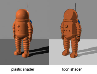
Cell-shading
Cel-shaded animation (also called "cel-shading" or "toon shading") is a type of non-photorealistic rendering designed to make computer graphics appear to be hand-drawn. Cel-shading is often used to mimic the style of a comic book or cartoon. It is a somewhat recent addition to computer graphics, most commonly turning up in console video games.

From http://en.wikipedia.org/wiki/Cell-shading
I've heard about cell-shading many times before actually do some researches. Above is the definition from wikipedia. I actually don't care much what they say. Simply put, to me, cell-shading is a technique of coloring that uses block of colors to render an image, creating the feeling of depth (but obviously still 2-dimensional).
Cell-shading is most used in anime and animation. In the definition above, they said that it's used in comic books books and video game. I've seen comic books using cell-shading, not many though, but the best examples are Spiderman and Superman. The same thing goes for video games, aside from Digital Devil Saga, I admit that I've never seen any other games that use cell-shading. With the development of 3D technology, the game makers usually make their games look more 3D than 2D.
As said, cell-shading is most used in anime and animation although in some animation and most anime, the background is usually rendered more realistically (it means that they use less cell-shading).
 (http://en.wikipedia.org/wiki/Image:Ichigo_Kurosaki.jpg)
I wonder if it's because of cell-shading that to me every animes look like they've been drawn by the same artist (whereas they look totally different in the manga).
Saturday, March 24, 2007
You cannot dig a hole in a different place by digging the same hole deeper
We had a very interesting lecture about creativity last week, which made me think a lot.
"You cannot dig a hole in a different place by digging the same hole deeper" (Edward de bono)
Literally, it's right. However, when I adapt the idea in to my work, it's just not alright. The problem is because I don't have the courage to abandon everything I've done thus far and start over again. I'd feel that it would be a complete waste while I don't even know what I'm going to start over will be good. But the funny thing is that whenever I'm forced to start over (like when I'm working on photoshop and accidentally flatten the whole things), it usually turns out to be good. But whenever I try to do a different approach, it seems that someone is saying "You won't be that lucky this time". It seems that everything is going in a circle, or it's like "I want to dig a hole in a different place but I cannot climb out of the hole I've just dug".
I've realized this problem a long time ago, but wasn't sure that what I thought was right. After this lecture, I think that I have more courage to sometimes abandon what I usually do and try a different approach.
Saturday, March 17, 2007
What I'd like to do?
(typing the post for the second time, because for some stupid reasons, my previous post was all blank >_<)
I always have a clear idea what I like best in the design field: graphic design. It's not that I don't like other things, it's just that I can't make really good product in web design, sound or video. Designing web layout is fine for me, but making it a real website is something I don't want to, due the the difference between browser and security issue. Sound and video are nice and I usually have a lots of idea about these but hardly anything comes out right. It requires more equipments which I can't afford at home. One other reason is that they usually (if not always) require team work while I don't like team working. I prefer working alone with my own equipments, and graphic design simply satisfies my condition. Moreover, only in graphic design that I can stay really close to my motto: "keep it short and simple (because I can't make it long and complicated)".
In a less practical aspect, I've also wanted to work in the game industry. Not involving with the techinical stage, of course, but working on the base concept, for example: writing the main plot or designing battle system. Anyway, it's no longer my true goal any more but if I ever have a chance to work in the game industry, I'd definitely give it a try
Subscribe to:
Posts (Atom)